Ultimate Comics Ultimates (2011)
honestly I don’t know what else to call this so I’ve just been calling it this. sorry.
After spending years and years reading nothing but Manga
But with the recent addition of Reed Richards (Mr. Fantastic) I was given my entry point: An alternative skin for him was shown off showing his Maker persona, something of which I haven’t really seen before at all. All of the comments about it were surprised and happy that they would showcase “such a dark and cool variant of the character”, which led to a lot of confusion for me. A quick google search later and I was quickly shown images of Tony Start getting his skull cut open to extract an Infinity stone from his brain, and from that point forward I knew that this was something I really wanted to read so I could figure out what the hell they meant by that.
So a quick search later and I had the comics on my Ipad, and I got reading. There was only around 30 issues, so
I figured I could read about one issue a day and be done in a month and be happy with that progress. However, I
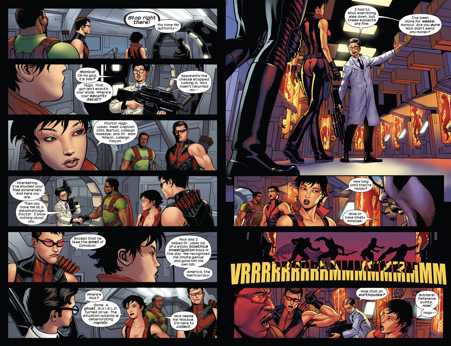
was quickly obsessed with the beautiful art of the dynamic team of
Esad Ribic (art) and Dean White (colors). My perception of western comics has
always been the generic western comic style


This was awesome to see. I absolutely loved the way the characters looked, as well as the way colors looked on absolutely every surface shown. It all felt so fresh to me, almost like a graphic novel instead of a comic. I loved reading every issue, often pausing to gawk at how good every big “wow” moment looked whenever the story commanded it.
This is where I talk about the lettering.
You knew this was coming. It’s me. The Letterer. Despite my talents being mostly focused on Manga lettering, a lot of the skills have a bunch of crossover. The same mental science that goes into making words flow onto a page is the same in manga as it is in comics. The lettering for all 30 issues of this comic were done by Clayton Cowles, and he honestly knocked it out of the park. I could only find one single instance where I noticed a slight error, and it was “Oh the text size decreased, but the leading is the same.” Everything else was perfect, much to my pleasure. I’ve told a lot of people about this, but bad lettering completely ruins the reading experience for me. But I can tell full well that Clayton Cowles is a veteran of the industry and I his lettering made the story so much more engrossing for me, ESPECIALLY some of his more bombastic sound effect works, like so:

Absolutely beautiful. The color of the KKKKRSSSSHH! matching the window, the fragmenting of it matching the window breaking, all of it bending around the art itself without being too distracting or overbearing is honestly just as good as the art surrounding it. A wonderful sight for this picky eater. The choices of fonts for locations also really helped get me hyped whenever time or locations changed, overall every choice felt intentional and methodical. I salute you, king.

The first arc
My problems starting arising with the comic’s 2nd arc: After the defeat of The Maker at the hands of The Ultimates, the story was very unceremoniously thrown into what felt like a B-plot involving the broken up United States, which was left in a horrible state from some earlier comic series. Things like entire states being deemed lost causes, the entire west coast being its own state, and a bunch of other really confusing stuff. The scale of the series sadly went from “We have to save the world from this insanely advanced race of humans” to “Hey Texas just threw a nuke at us, uhhh lets stop them from doing that I guess.” Of course, I understood that they had to do this to set up the final arc by fleshing out Captain America a little more for the story.
This brings my other real part of criticism with western comics as a whole: the replacement of art teams completely between arcs. As soon as the City arc was over, Esad Ribi’s beautiful art was gone, and in it’s place was something that was way more western-comicy to my eyes. It wasn’t Bad, per se, but it was definitely not the same art as the previous chapters. It made the story feel like it lost a lot of it’s excitement for me, and it was also something I’ve never really experienced before because the idea of that happening for a manga series is just unheard of, and would honestly have people having meltdowns online over it. It’s probably a normal thing for western comics, but it sure was a little bit of a downer for me.
After The City arc, the comic looked like this for almost the rest of the entire series.
Much to my disarray, most of the important parts of this arc took place in my home town of Bakersfield, California for some god forsaken reason. This gives it minus points. This is my domain and I make the rules. Anyway, a large chunk of the comic is just them trying to bring the United States back into one union. This stuff is pretty boring until they make Captain America the President of the United States in a honestly kind of comical way: He goes to California and starts just kicking ass on TV and everyone is so impressed by him kicking ass that everyone starts writing in his name on the presidential ballot write-in. He wins and then immediately jumps into a VTOL F-22 for some reason and goes to fight more civil war shit. Honestly kind of badass, but I couldn’t help but laugh the entire time at how absurd the entire thing was.

like yeah man. sure. get in that fuckin jet and go kick some ass. oorah.
That being said, this arc DOES end well. The final battle between Hydra and California versus the Ultimates was a fantastic fight with incredibly well-done visuals, and some beautiful framing. Also, it’s just really fucking cool. It all felt very larger than life despite the rest of the arc feeling super grounded, and it was a nice return to form for the rest of the story. Some real GAR shit honestly.

kino
Finally, after all of the wars in America are solved

yeah whatever man
I much enjoyed the final arc though: The stakes accelerated quickly and dramatically to warrant a bombastic ending to the comic series with the return of Reed Richards and a new mysterious force of Kang. I only knew Kang by name, and the comic heavily implied that it was Wanda Maximoff, a character I knew about because I watched wandavision when covid was happening because what the fuck else was I going to do while covid was happening? It also brought in Quicksilver, one of my favorite X-Men characters, and they totally did him justice and he did a bunch of cool shit. Badass.
I won’t give anything else away, because I would hate to spoil more than I already have! If you think this sounds cool, go ahead and give it a read. The ending was surprising and the fights were excellent, and it really made me forget all about the weird America arc in the middle. It does have a “To be continued in this other comic” ending though, which honestly made me a little disappointed, but I still felt overall happy with where it ended and honestly it made me just want to read more. So what’s next? A co-worker pointed me towards Secret Wars (2015), also illustrated Esad Ribi and Dean White. However, it looks like I have a lot of reading to go through first before I can even touch that series, including a lot of Fantastic Four comics, so I’m not exactly complaining. Hope the stores are just as good as this one was.